Monday, November 23, 2009
Propaganda Advertsing
Appeal to Fear
The first poster is an attempt to get smokers to quit by showing the pain caused by smoking with a fish hook, it is also a metaphor for addiction. The second ad is aimed at parents, the goal is to get parents to visit ready.gov to make up an emergency plan for their family.
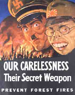
Propaganda Posters
Appeal to Fear
These posters use fear to call Americans to action. The one on top shows Hitler and a Japanese man (our enemies during World Wars 1 and 2) in front of a forest fire to sow how a national tragedy leaves us vunerable to attack. In the second posted Hitler promises to have Storm Troopers in the US.
Wednesday, November 4, 2009
Art Nouveau
Monday, October 26, 2009
Wednesday, October 7, 2009
Wane
Children of Destruction 1980s
Wane, Michelob, Wen, Latin, Face, Wips, and some others made up The Children of Destruction; a group of graffiti artists in New York City. I like this one especially because of the depth it has. The yellow background behind the colors makes them almost three dimensional. The way the outline around the words is blue on the top and red on the bottom gives it the feeling of a shadow underneath.
The Dancer's Reward
Aubry Beardsley 1893
Art Nouveau
Aubry Beardsley 1893
Art Nouveau
Aubry Beardsley was one of the most controversial artists of the Art Nouveau movement because of his many pieces of erotic art. He used black ink, and his work is clearly influenced by the Japanese culture. I like The Dancer's Reward because of the texture. The blood, hair, and the gown all seem to have very different textures even though this is done using only one color.
Wednesday, September 9, 2009
Gone with the Wind
Gone with the Wind 1939 by New Wave Creative
New Wave Creative uses color to create motion in their poster for Gone With the Wind. By using layers of pictures they draw the eye down to the title.
Bunny Lake is missing
Bunny Lake is Missing 1965 by Saul Bass
The torn paper texture of the doll brings visual interest to the right corner and make the poster off balance but still helps to moves the eye around the poster.
THe Omen 1976
The Omen
Designed by Tom Jung in 1976. The title being the only color element in the poster gives it a lot of weight and the shadow in front of the boy gives it depth.
Subscribe to:
Posts (Atom)